 We know that the security of your password manager is important, so we’ll be emailing all LastPass users to alert them to the change, in addition to spreading the news via our blog and social media accounts.
We appreciate the ongoing support of our loyal community through the transition. Standing strong under our new logo, we’ll be focused on delivering the best password manager and looking ahead to the future of identity and access management.
Be secure,
Joe Siegrist
VP & GM of LastPass
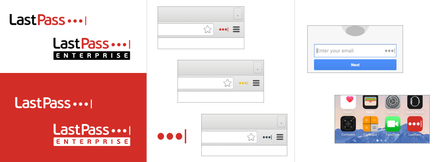
Today we’re unveiling a new LastPass logo that you’ll soon be seeing across our entire service.
There are a lot of considerations that go into any logo update, and ours was no different. The asterisk that once was synonymous with hiding a typed password upon login has been a part of the LastPass logo since 2008. It was also the subject of an unanticipated trademark lawsuit, filed early last year. As a result, we started to explore options for retiring the asterisk.
Luckily, we were already hard at work on a new user interface for LastPass 4.0, where we aimed to introduce a refreshed, modern design across the LastPass product. And the reality is, when it comes to hiding a typed password at login, the asterisk has long been retired in favor of the ‘dot’.
So we took the best of our new design — fresh, bold, simple, colorful, modern, and user-friendly — along with the modern image of logging in, and crafted our new logo and icon.
Here’s what you can expect to see across our website, the browser extensions, and the mobile apps in the coming months:
 We know that the security of your password manager is important, so we’ll be emailing all LastPass users to alert them to the change, in addition to spreading the news via our blog and social media accounts.
We appreciate the ongoing support of our loyal community through the transition. Standing strong under our new logo, we’ll be focused on delivering the best password manager and looking ahead to the future of identity and access management.
Be secure,
Joe Siegrist
VP & GM of LastPass


